
PROBLEM
The Original Design Brief
I was tasked with optimizing Bumble's proximity-based notifications to drive real-world meetups. The Data Signal While reviewing a dataset of anonymized user analytics, I identified a critical breakdown: engagement with proximity alerts had plummeted. Retention dropped from 18% to 6% within six months. This suggested that knowing a match is "nearby" was no longer a sufficient motivator for users. AI-Assisted Forum Research To find the "why" behind the numbers, I synthesized themes from Reddit and community forums. The qualitative feedback was clear:
SOLUTION
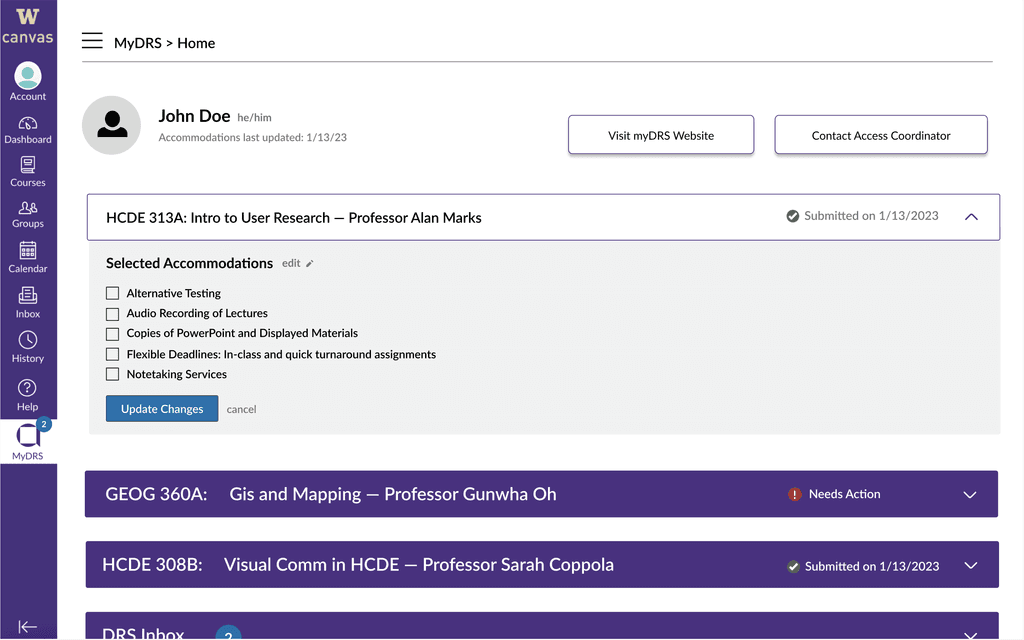
The new DRS application process


SECONDARY RESEARCH
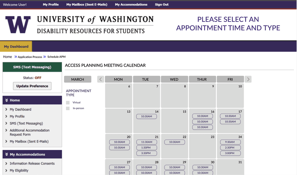
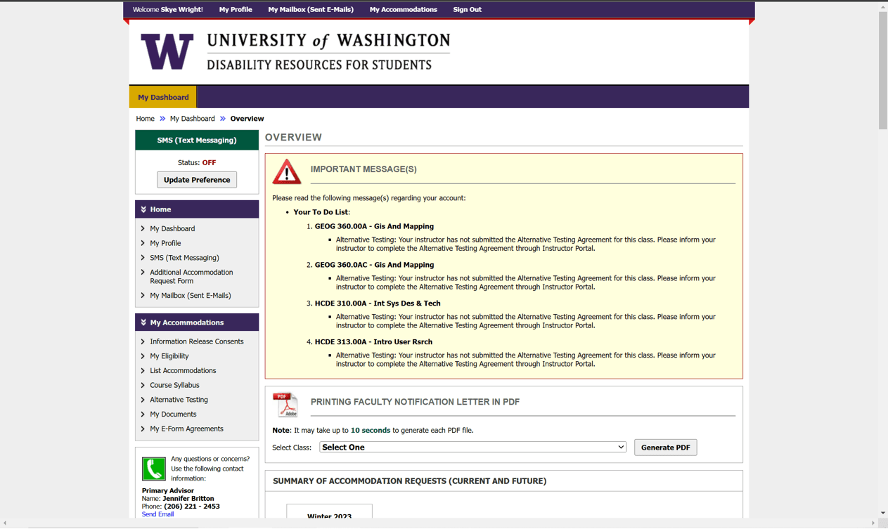
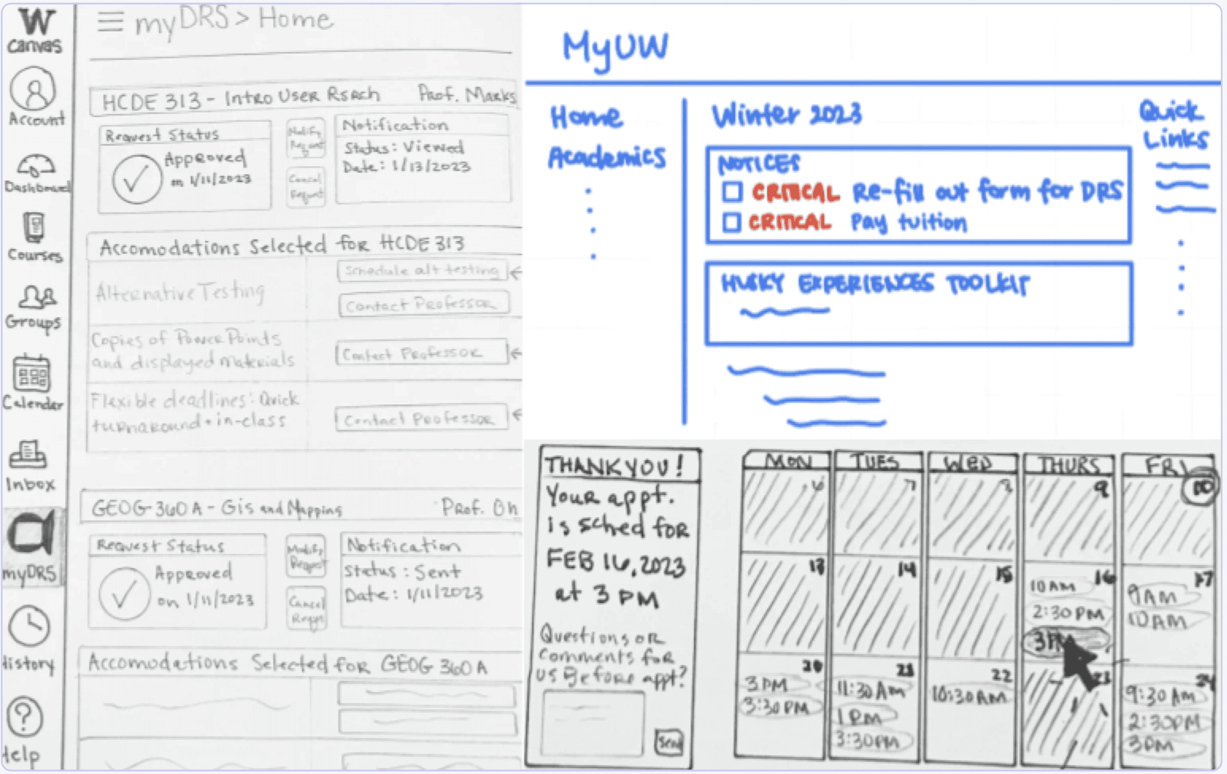
How does the system currently operate?
SURVEY INSIGHTS
Most students are not receiving accommodations
1)
66% of students received no response after applying for an accommodation.
2)
71% of students who received a response waited 1-2 months for an appointment.
INTERVIEW INSIGHTS
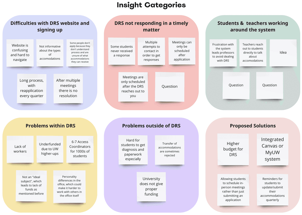
Challenges in Accessibility: Application Complexity, Activation Oversight, and Coordinator Load
A common finding was the unclear wording on the website, affecting both students and professors during the application process.
"The application process is too hard to understand."
1
"I always forget to activate and submit my accommodations."
2
Due to the multiple platforms and complexity, students often forget to renew applications and notify all instructors each quarter.
DESIGN QUESTION
IDEATION
Brainstorming solutions with sketches
LOW FIDELITY PROTOTYPING & TESTING
Reduce repetition
in button and info layout
Clarify DRS Info.
for system newcomers
ITERATIONS
Incorporating the feedback we've received
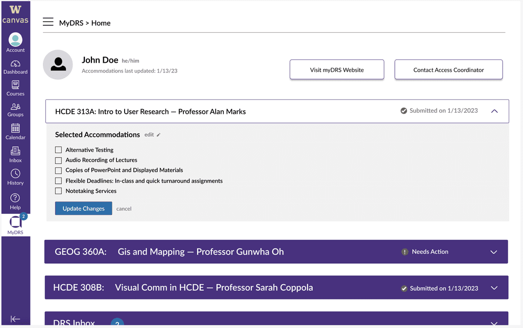
Introducing a Profile Section:
In response to feedback regarding the tab's ambiguity, we enhanced clarity by introducing a profile section, clearly designated as the user's personalized DRS profile. This modification not only improves understanding but also facilitates direct application adjustments within the portal.
Streamlining Content:
In addressing concerns about excessive button options, we transitioned to a more user-friendly selection list format. Additionally, we optimized the user journey by prioritizing essential actions at the top, minimizing redundant elements.
Class Status Display:
Furthermore, we enhanced user experience by displaying the status of each class letter without requiring individual dropdown access. This enhancement offers a more efficient and user-centric method for monitoring status across classes.
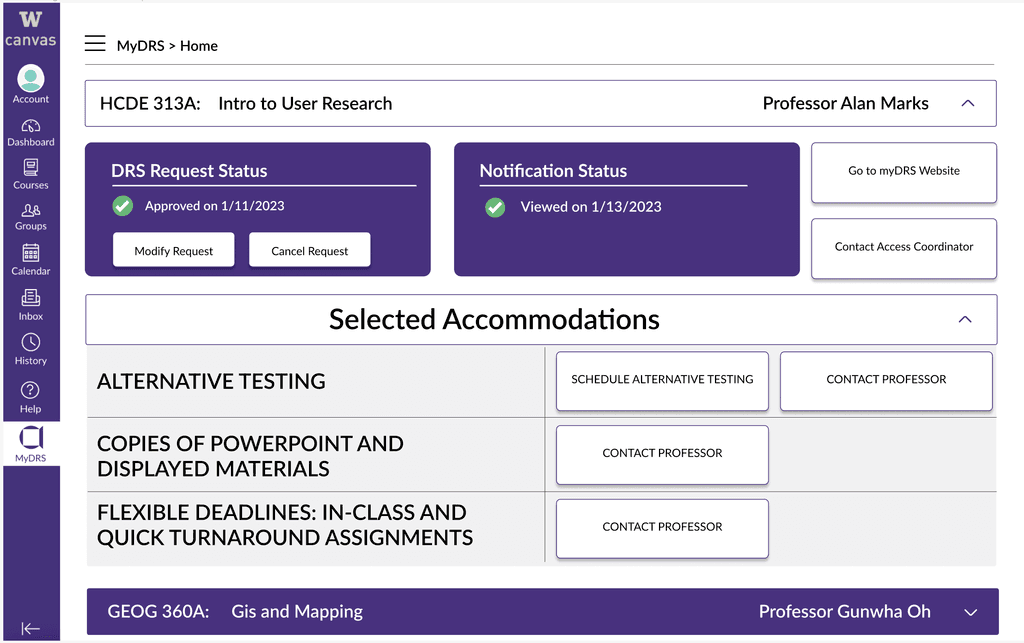
FINAL SCREENS
The new DRS application
REFLECTION
Bringing our course project to life and tackling a real problem
Obstacles Encountered:
The project faced challenges due to a tight 10-week timeframe, limiting depth of investigation and necessitating efficient prioritization. A low response rate also posed a significant hurdle, suggesting potential lack of awareness about Disability Resource Services (DRS) among UW students. This may be due to the relatively small demographic of DRS students within the broader UW community. Additionally, the team lacked direct insight into the DRS system, as none of the members currently utilized DRS services.
Key Learnings:
Amid challenges, the team learned to commence surveys and interviews promptly to ensure timely data collection. We found that the design process is flexible, molding itself to project requirements. Rather than prioritizing high-fidelity wireframes, our emphasis was on gaining profound insights and devising innovative solutions.
Future Outlook:
In the future, our team intends to connect with DRS staff to deepen our understanding of the system. We aim to tackle project-identified challenges and improve the overall effectiveness of DRS at UW. By advocating for Canvas-DRS Integration, we seek to provide significant benefits to campus students, ensuring they have the necessary tools for academic success.