Bumble Flow
Designing for Readiness, Not Just Proximity
My Role
Lead Product Designer Design Engineer
Timeframe
4 weeks
Tools
Codex CLI (Vibe Coding) Next.js React Figma
THE CHALLENGE
The Original Design Brief
The project began with a speculative brief from the Bumble Customer Acquisition Team. The core focus was purely transactional: leverage location data to drive subscriptions.
The Original Mandate:
THE GOAL
Increase conversion among non-paying users—90% of whom are under 35.
THE HYPOTHESIS
Users would convert to paid subscribers if they were notified of matches within 0.5km via "timely notifications".
THE TECH
Use precise location services to alert users on mobile, desktop, and watch.
REFRAMING
Proximity Without Intent: “Nearby Matches” Don’t Lead to Dates
While the brief focused on proximity, the data told a different story—engagement with proximity alerts fell from 18% to 6% in six months, suggesting “nearby” wasn’t enough to motivate users.
Scale: 0–20% for comparison
6 months ago
18%
Today
6%
To uncover the “why” behind the numbers, I synthesized themes from Reddit and community forums:
MISLEADING PROXIMITY
Users are shown people who are “nearby” but not actually available or local, leading to wasted time and frustration
THE "AWKWARD" GAP
Users liked each other but stalled when it came to the manual "labor" of scheduling.
DISTANCE OF READINESS
Being 0.5km away doesn't mean a user is mentally ready to go on a date.
Bridging Business Goals with User Needs Through Real-World Coordination
By solving coordination friction, I could offer a tangible reason to upgrade that proximity alerts lacked. I moved location out of the UI and into system logic.
Proximity as a
signal
Readiness &
coordination
How might we help users recognize moments of shared readiness—moving beyond proximity to enable real meetups?
"
"
INITIAL CONCEPT & FEEDBACK INSIGHTS
Fully Automated Scheduling Felt Invasive and Reduced User Control
My initial concept fully automated same-day scheduling through calendar syncing. But testing showed that efficiency came at the cost of control—users felt overexposed, and real-time availability made interactions feel monitored rather than natural.
From testing, three key issues emerged:
How these issues appeared in the initial concept sketch:
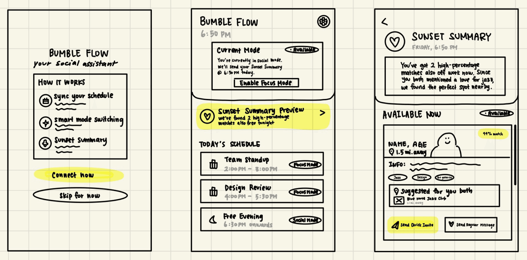
Issue
2
&
3
Identifying users as "Available Now" and "Nearby" removed the user’s social alibi, creating risk for unwanted confrontation.
Issue
1
Forcing a full calendar sync as the only premium entry point created a friction-heavy conversion path.
Issue
2
Automatic switch from Focus Mode to "Available" toggles based on calendar gaps failed to account for non-booked downtime.
Issue with concept 1
The value proposition relied on high-friction data access, weakening the business upsell.
“Wait, if I don't sync my Google Calendar, this whole feature just... doesn't work for me? That feels like a huge ask before I even know if the matches are good.”
Issue with concept 2
The system prioritized calendar logic over human readiness, creating user pressure.
“Wait, if I don't sync my Google Calendar, this whole feature just... doesn't work for me? That feels like a huge ask before I even know if the matches are good.”
Issue with concept 3
Real-time status broadcasting created safety vulnerabilities and social entitlement.
“Wait, if I don't sync my Google Calendar, this whole feature just... doesn't work for me? That feels like a huge ask before I even know if the matches are good.”
THE PIVOT
Design Transformation
I pivoted from a system that simply found gaps in a calendar to one that aligns shared intent before surfacing availability—ensuring every coordination nudge is grounded in mutual readiness, not just empty time.
From
To
Calendar Gaps
Assumes an empty slot equals social readiness.
Intent-Based
Users explicitly "opt-in" to specific time windows.
All-or-Nothing
Requires full calendar sync to unlock value.
Flexible Entry
Options for manual input or "privacy-first" sync.
Exposed
"Available Now" markers remove the ability to decline discreetly.
Protected
System suggests matches without broadcasting real-time status.
Feature-Locked
Value is hidden behind a high-friction data request.
Incentivized
Shows "Suggested Windows" to all; Premium automates them.
SOLUTION
Moving from "Who is Nearby" to "Who is Ready"
Bumble Flow transforms matching from a passive browsing experience into an active coordination engine. By prioritizing shared intent and real-time availability, the system removes the "scheduling labor" that often causes matches to stall, creating a clear, low-friction path from conversation to a confirmed plan.
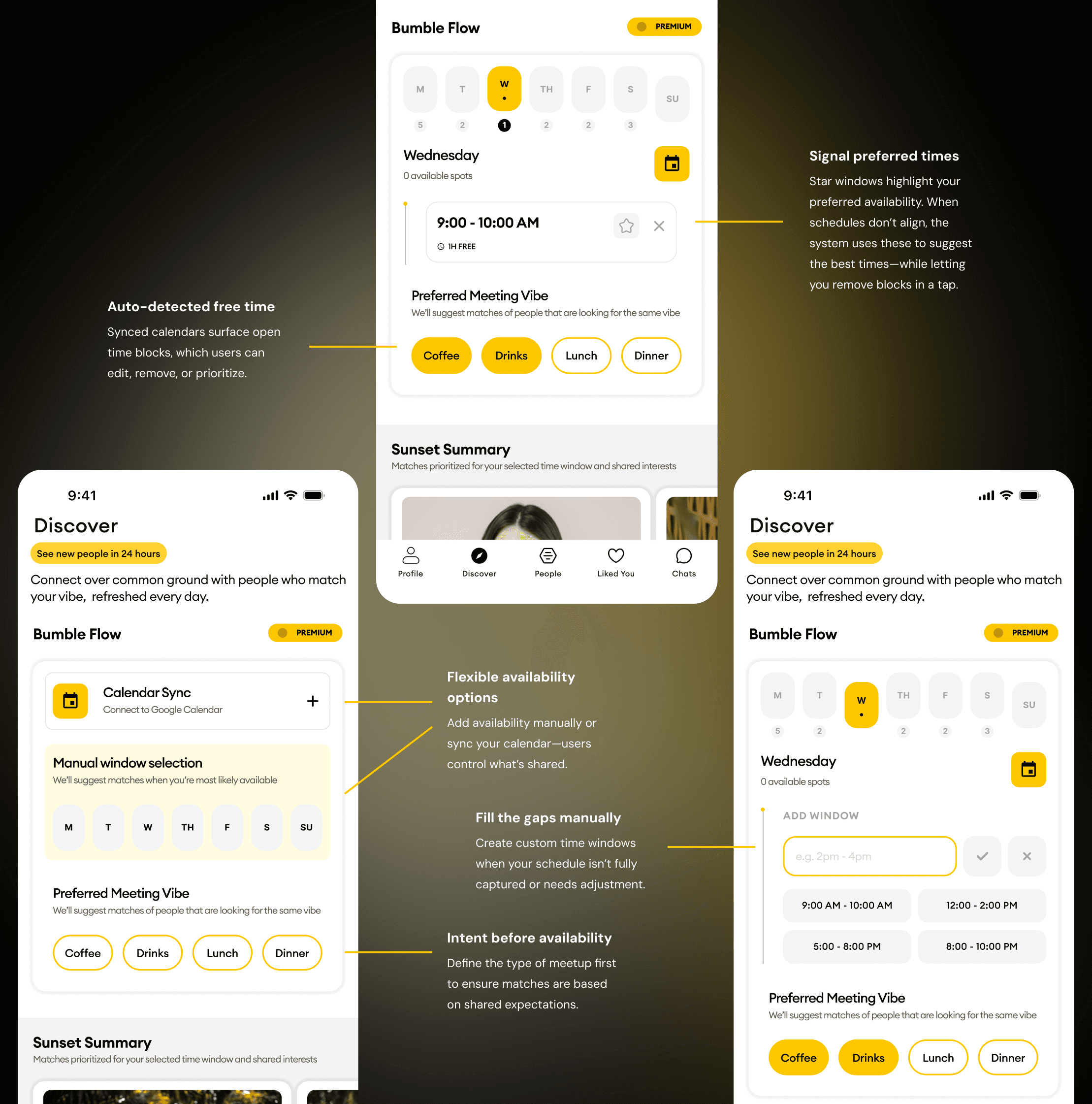
INTENT-FIRST MEETING VIBES
Users select a preferred meetup type—like coffee or drinks—to ensure both parties are aligned on the date's expectations before messaging begins.
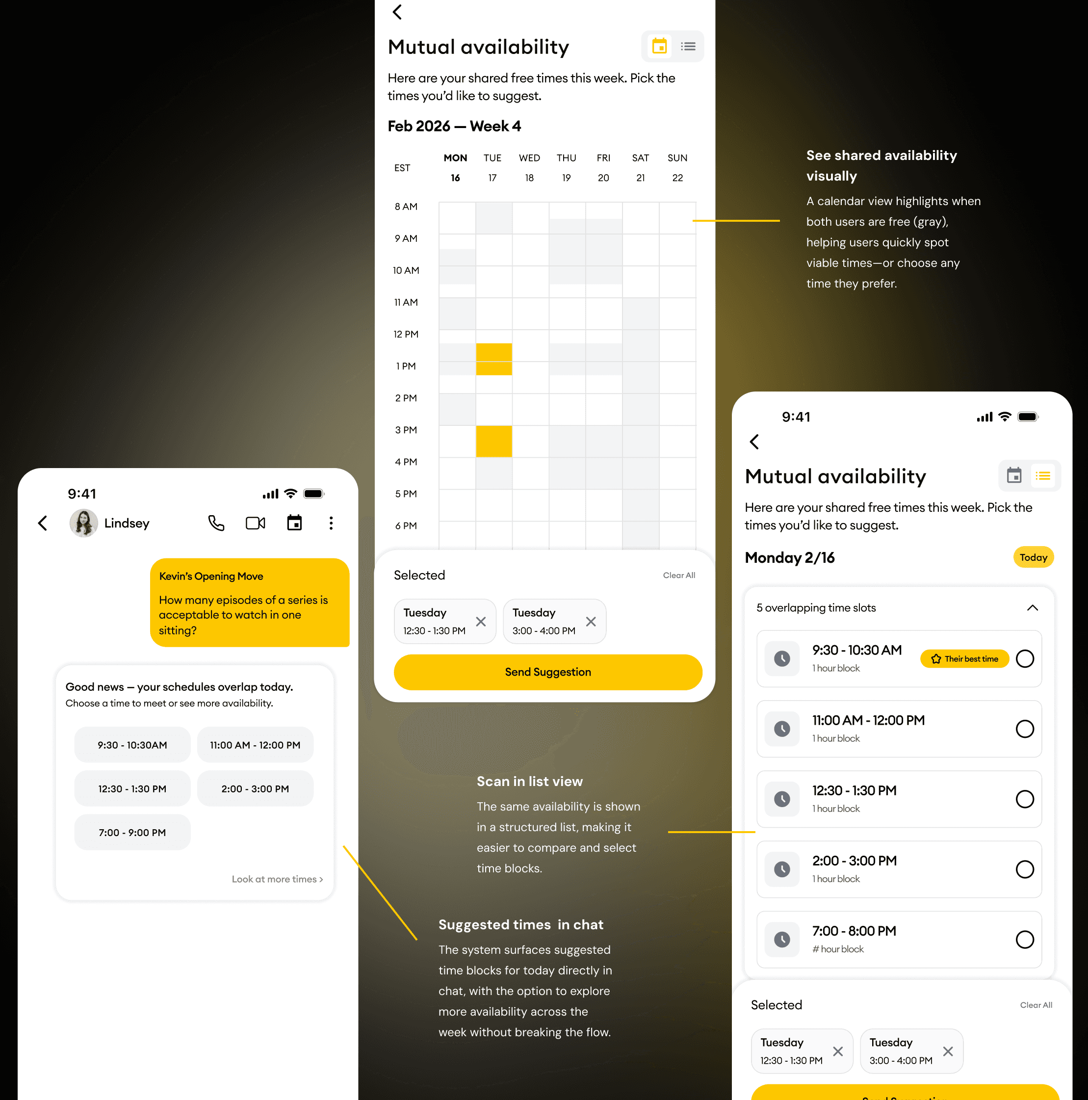
SMART MUTUAL AVAILABILITY
The system reconciles Google Calendar data to surface precise, overlapping free blocks in chat, allowing users to suggest or accept times in a single tap.
TIERED COORDINATION INTELLIGENCE
Premium users benefit from full calendar automation and precision, while free users are nudged toward coordination with general time-of-day suggestions.
Defining Availability and Intent Signals
Users input when they’re available and what they’re looking for—combining manual controls, calendar sync, and preference signals to shape matches and time suggestions.
Coordinating the Right Time to Meet
Surface shared availability across chat, calendar, and list views—helping users quickly compare options, select a time, and move from conversation to a confirmed plan.
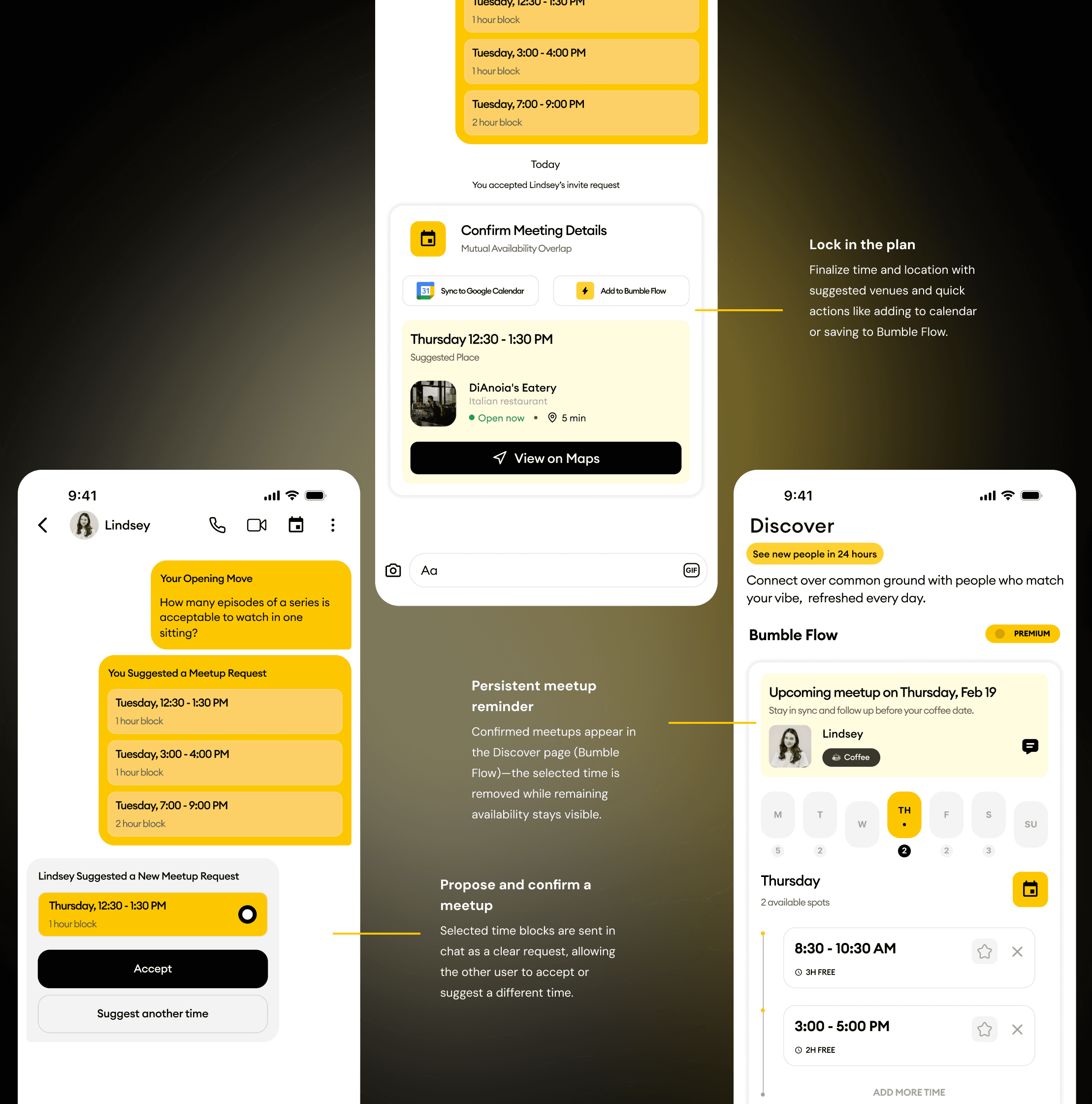
Turning Plans into Confirmed Meetups
Users move from selecting a time to committing to a plan—proposing, confirming, and managing meetups while keeping availability flexible for future coordination.
DIFFERENT USE CASES
User experience scenarios
3 relationship types show how the engine behaves at different levels of data and subscription:
1
Premium x
Premium
2
Premium x Free
3
Free x Free
Click on each level of the pyramid to explore how coordination changes across different user states
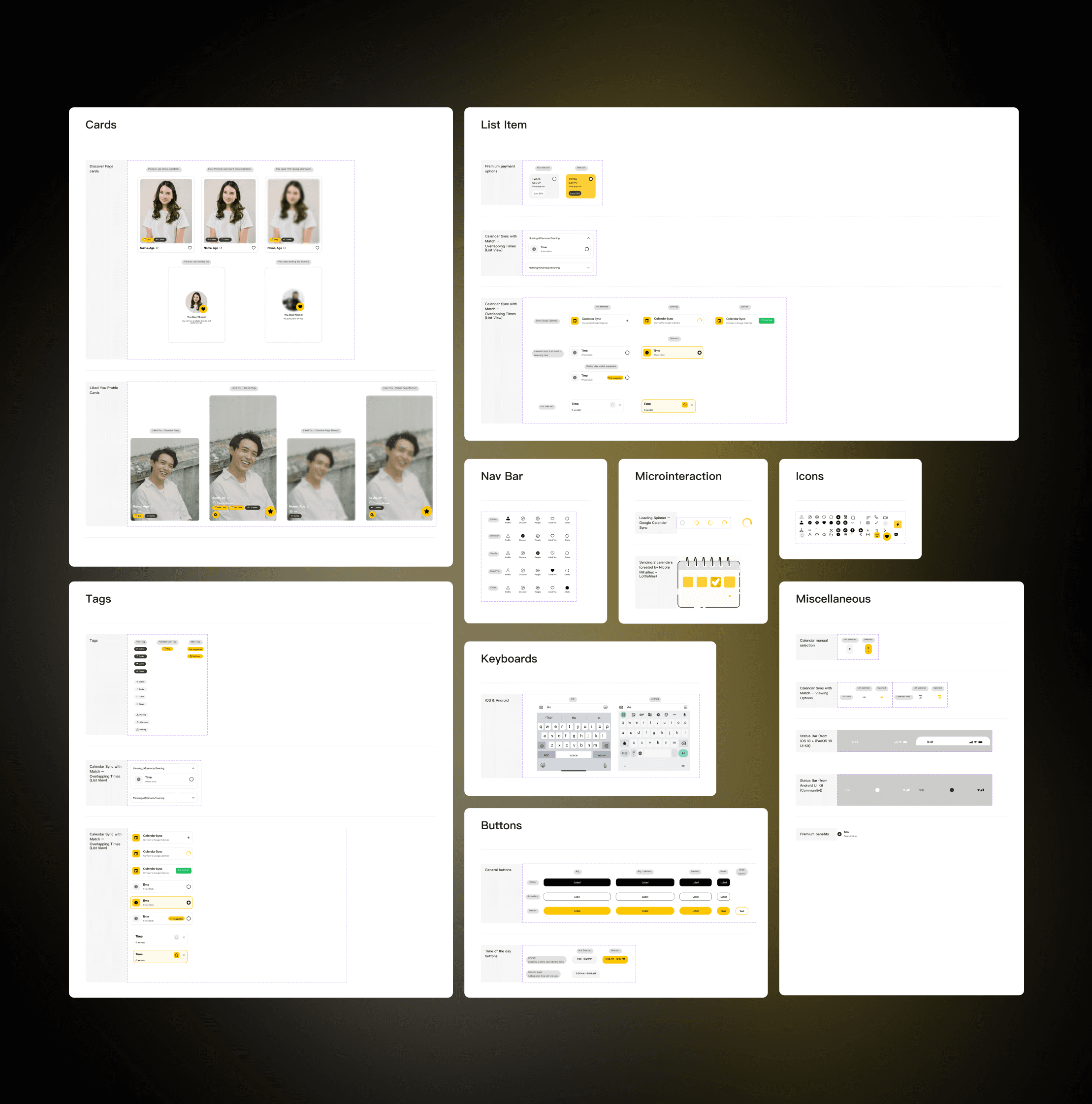
CORE COMPONENTS
Design System
The Bumble Flow design system ensures consistency and efficiency through components, guidelines, and patterns.
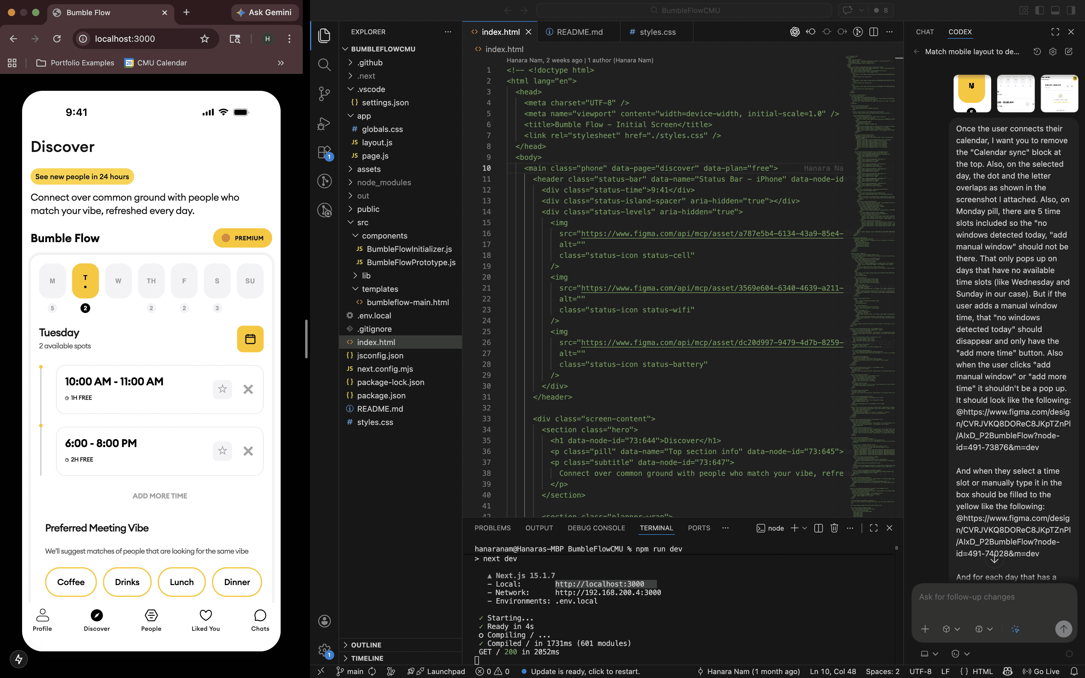
PROTOTYPE
Building out Bumble Flow with vibe coding
Using Codex, I vibe coded an interactive prototype by translating my high-fidelity wireframes and design system into a working flow—allowing users to define availability, signal intent, and explore how the system surfaces overlapping or alternative meeting times in real time.
Vibe coding with Codex
I connected my Figma file—where my design system and high-fidelity wireframes lived—into Codex, then iterated by giving detailed, handoff-style instructions. I combined structured prompts, screenshots of specific UI states, and MCP links to guide layout, interaction logic, and edge cases—treating the system like a design partner rather than a generator.
REFLECTION
Reframing the Issue: Designing for Coordination, Systems Thinking, and Real-World Outcomes
This project pushed me to balance user empathy with business goals in a more intentional way. By reframing the problem from proximity to coordination, I was able to address real user pain—like the “awkward gap” in scheduling—while also creating a clearer path for premium value.
It also challenged me to think beyond static screens. Designing for different scenarios—like Premium vs Free users or mismatched availability—forced me to think in systems, accounting for edge cases and ensuring every state felt intentional and safe.
On the technical side, I shifted from one-shot prompting to a collaborative workflow with AI. I treated my Figma designs as the source of truth and used detailed instructions, screenshots, and checkpoints to guide the output—more like working with a teammate than a tool.