
PROBLEM
Students at the University of Washington faced difficulties in deciding where to eat throughout the day
The average American spends approximately 30 minutes a day deciding what or where to eat. This is mainly due in part to the Paradox of Choice, which suggests that an abundance of options makes it more difficult for an individual to decide. In deciding where to eat, this issue is amplified in group settings as people are more considerate of one another, significantly prolonging the decision-making period. This often leads to unnecessary conflicts and a waste of quality time.
SOLUTION
USER PERSONAS
USER JOURNEY MAP
Mapping Emotions to Design Needs: Understanding User Experience through Claire's Journey
DESIGN REQUIREMENTS
Our key design requirements are features that our design must have, which shaped and informed our lo-fi prototype.
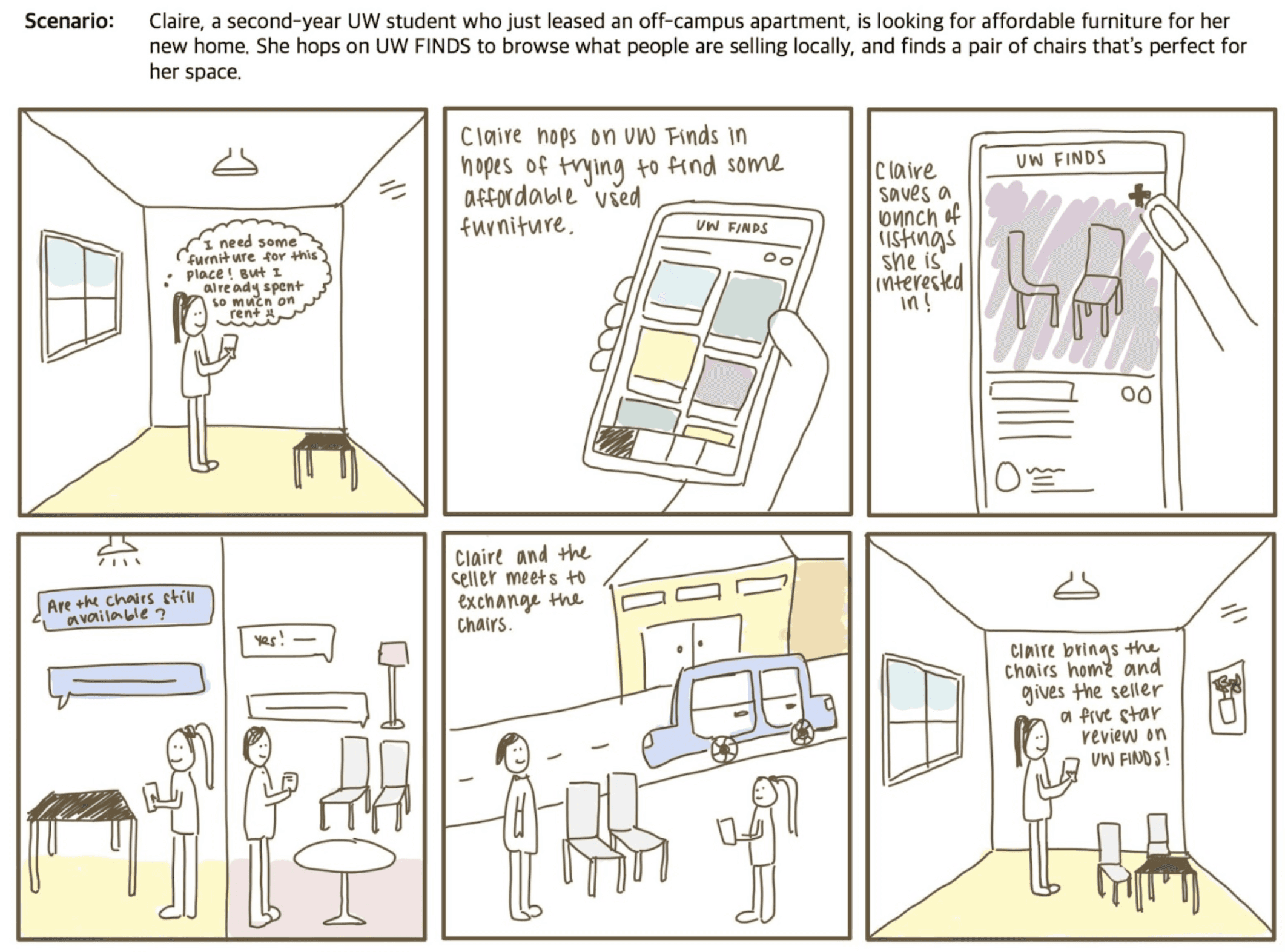
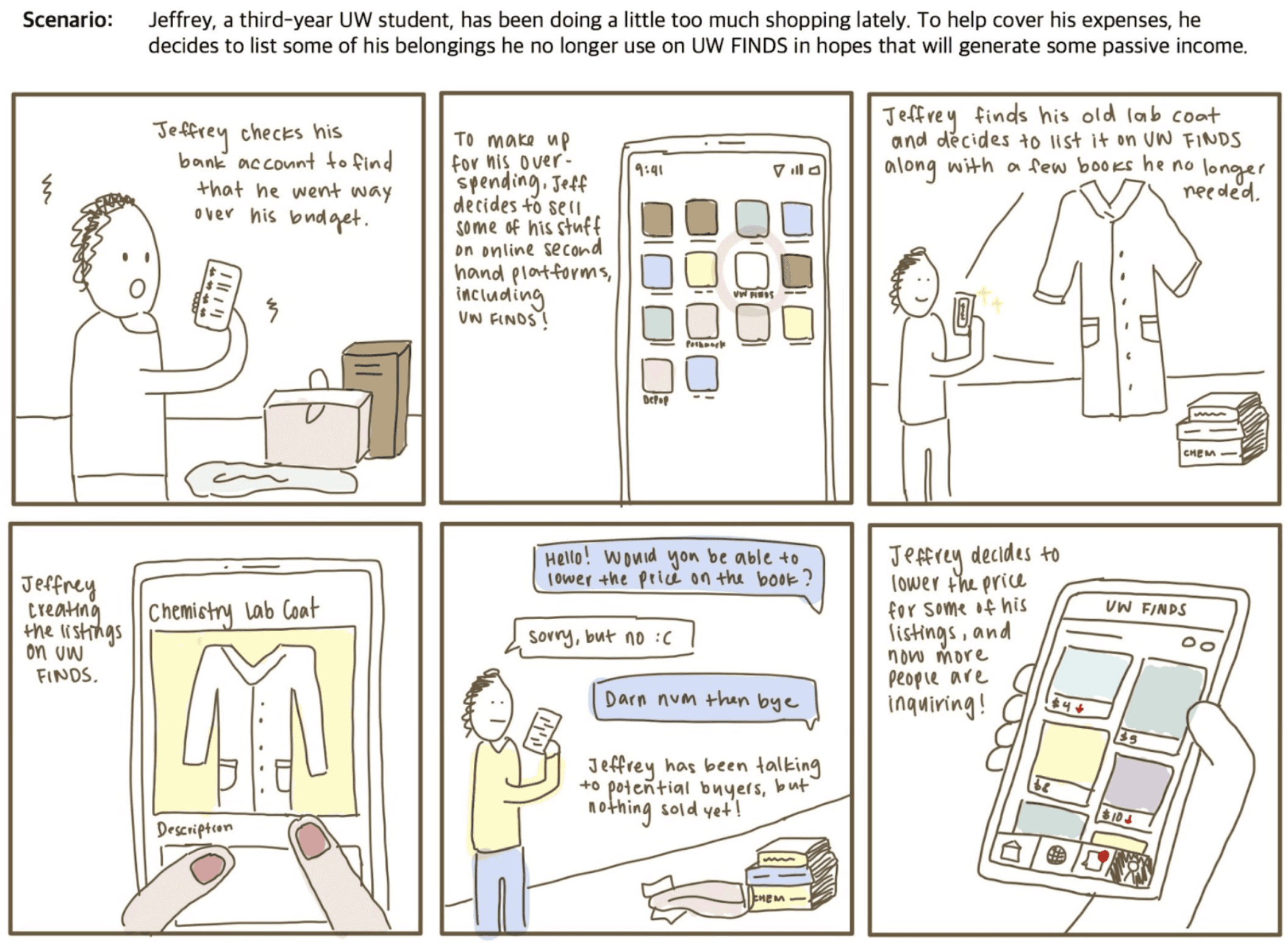
STORYBOARDS
Two Storyboards: Buyer and Seller Perspectives
The storyboards depict user journeys in specific scenarios, illustrating interactions with our product. Inspired by personas and the user journey map, they provide a realistic view of user experiences with our product.
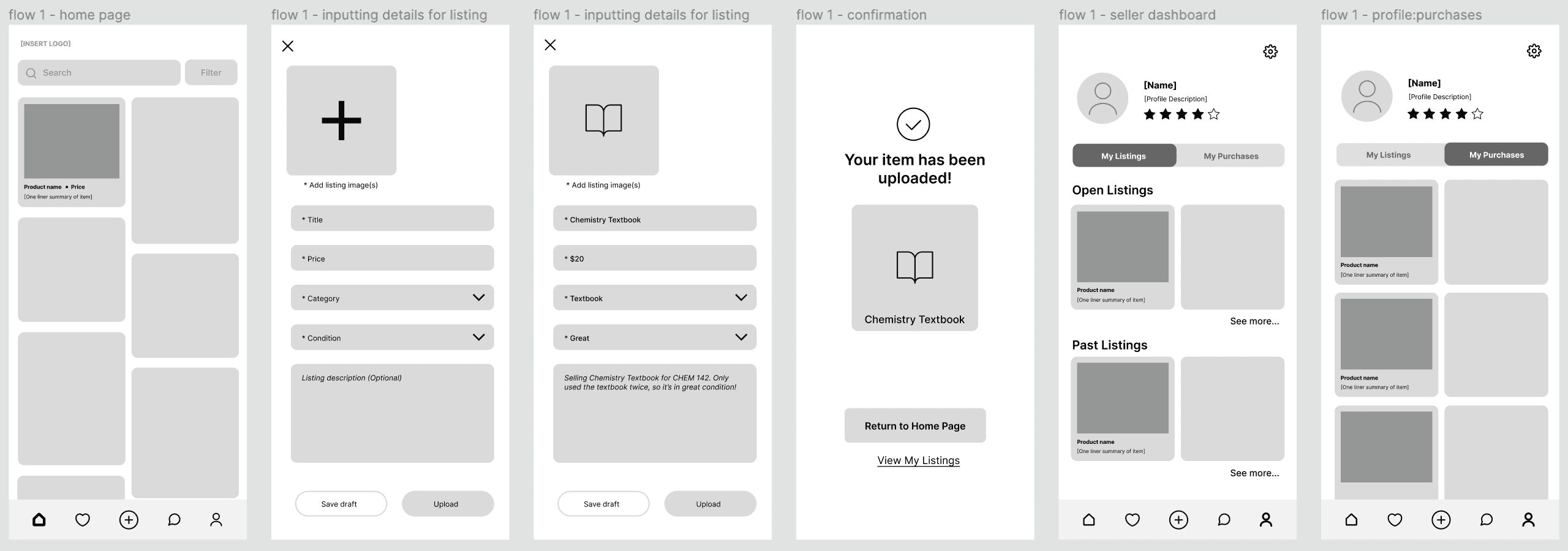
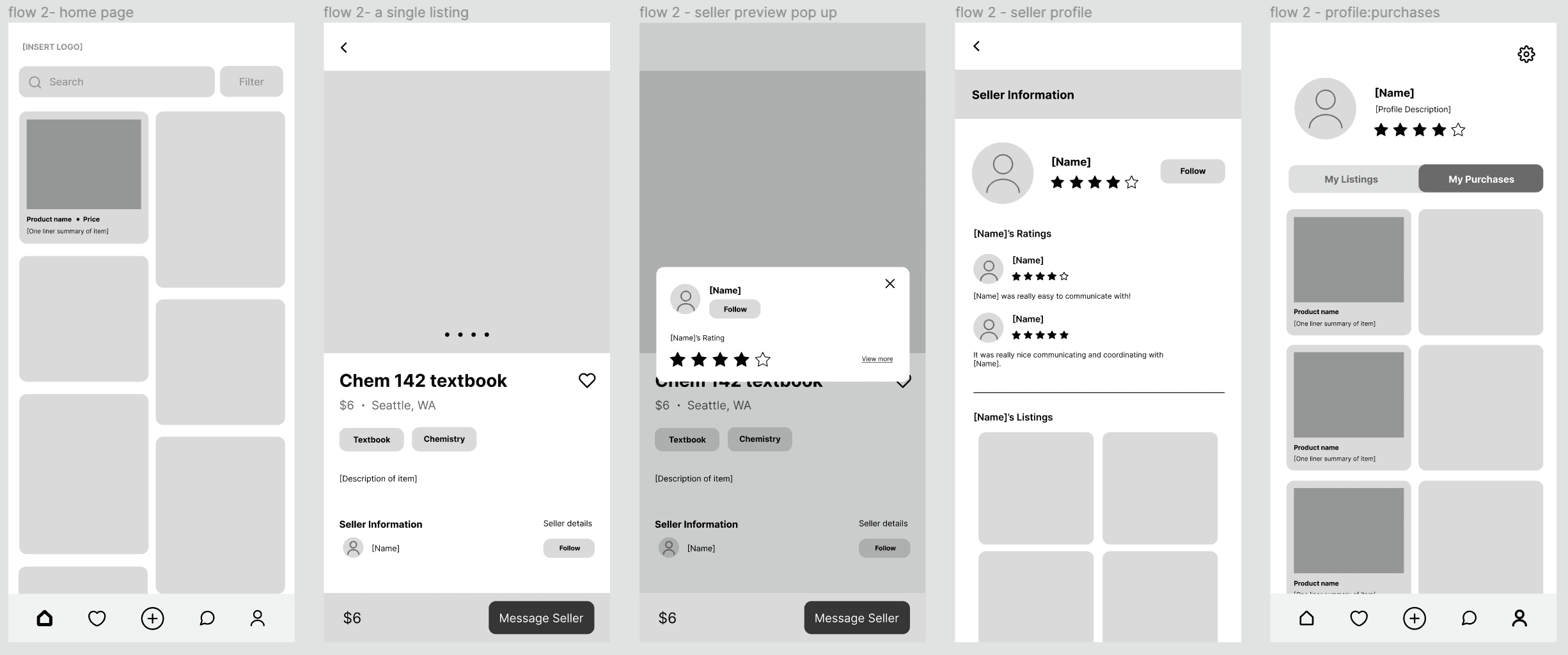
LOW FIDELITY PROTOTYPE
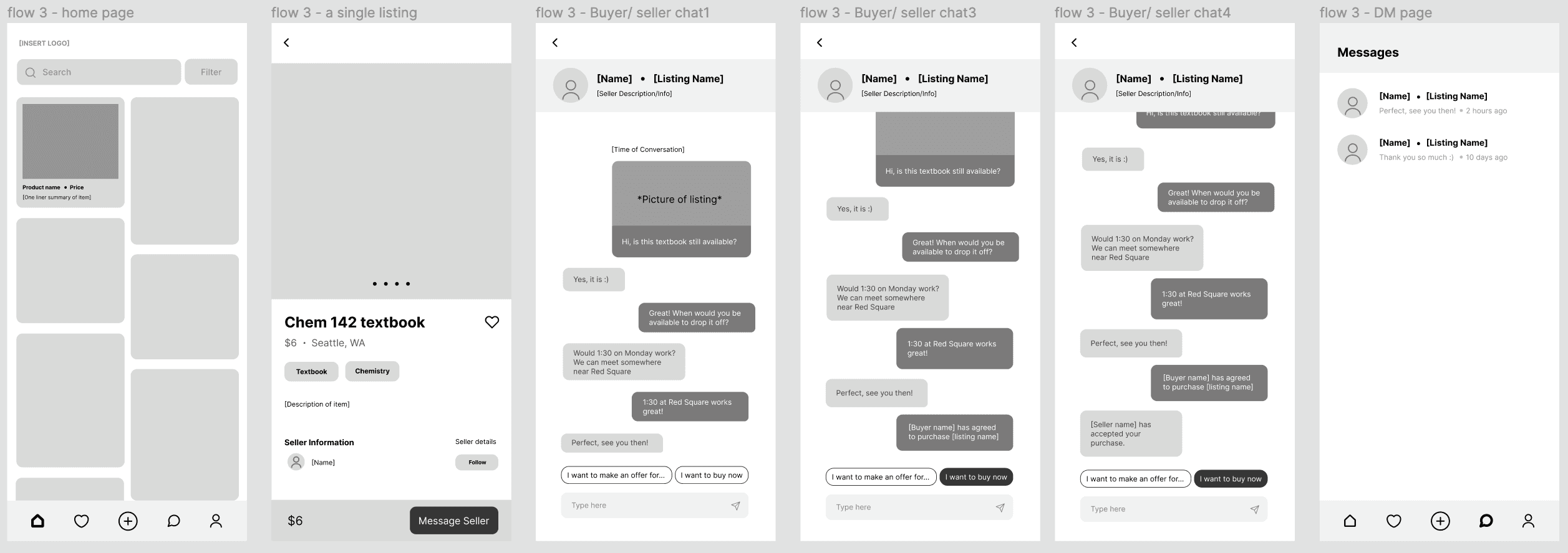
3 Main Flows: Upload Listing, View Listings and Seller Profile, Chatting Feature for Seller-Buyer Communication
We created a gray-scale, low-fidelity interactive prototype on Figma, making sure to include all components we wanted to include in our app.
FLOW #1 - UPLOADING A LISTING
FLOW #2 - VIEW LISTING & SELLER PROFILE
FLOW #3 - CHATTING + PURCHASE
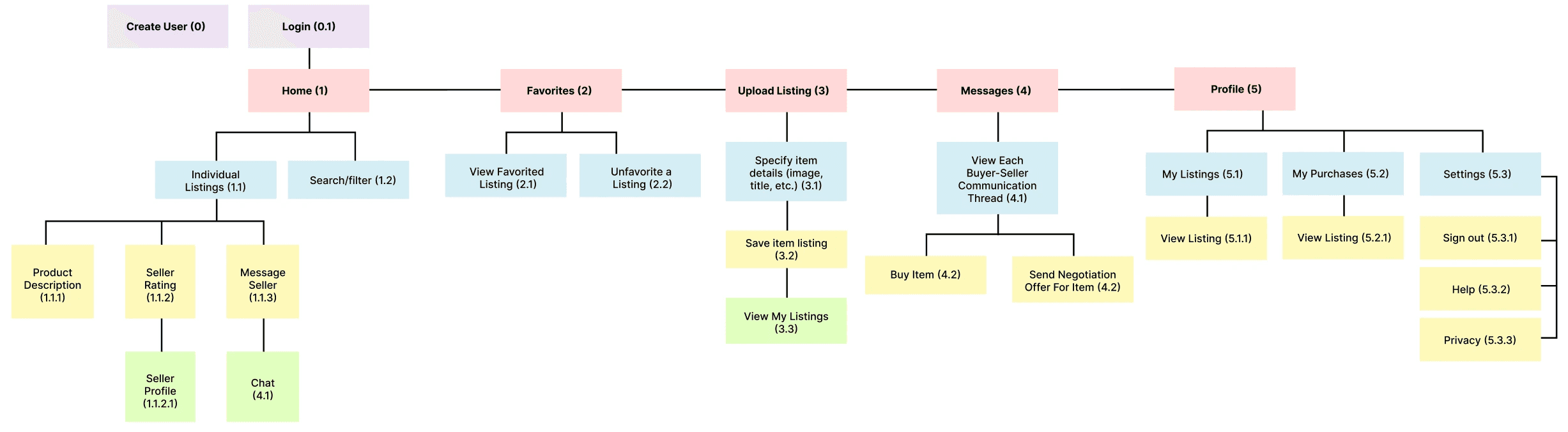
INFOMRATION ARCHITECHTURE
Mapping Pathways and Functionality
The diagram organizes and visualizes our design's pathways and subcategories, clarifying component connections. It serves as a comprehensive roadmap for our final hi-fi prototype, capturing our product's complete functionality.
USABILITY TESTING
Evaluation Plan
METHOD:
Introduced product goal and functionality, provided task scenario.
Gave low-fidelity interactive prototype to complete tasks.
Observed navigation, prompted verbalized thinking during tasks, and noted actions and live reactions.
Conducted post-interview for feedback on difficulties, likes, dislikes, desired features, and additional thoughts.
TASKS:
Uploaded a listing: Create and upload an old textbook listing, evaluated completion based on button usage and ease/difficulty.
Viewed a listing and its seller: Navigate to view listing and seller profile, evaluated completion based on navigation.
Messaged seller to purchase: Message seller about purchasing a listing, evaluated completion based on successful purchase and communication experience.
USABILITY TESTING INSIGHTS
Enhanced Seller Profile Access, Improved Chat Feature, Accessible Action Buttons, and User-Friendly Navigation Options
FINAL SCREENS
The final product
REFLECTION